A unifying identity for a neighborhood in transformation
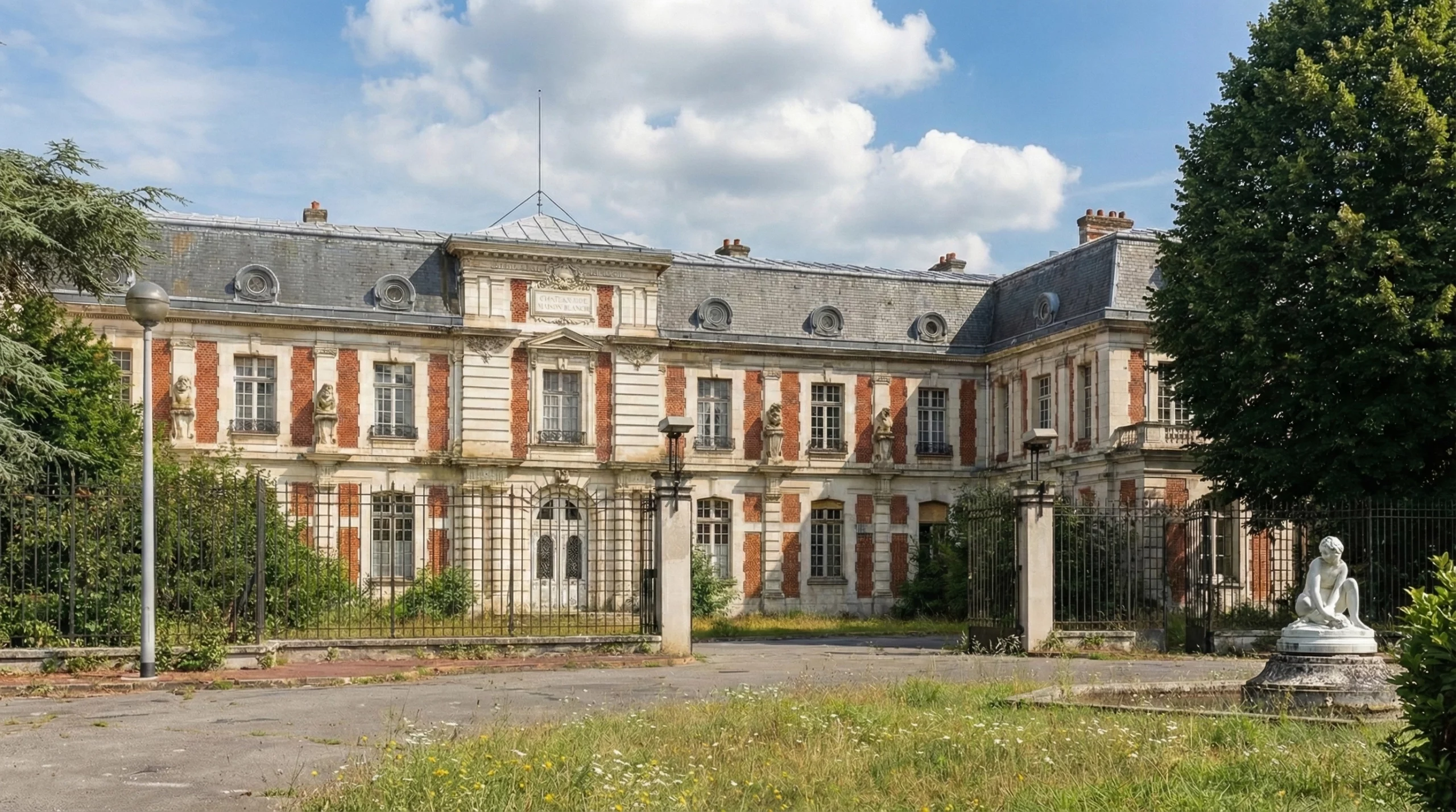
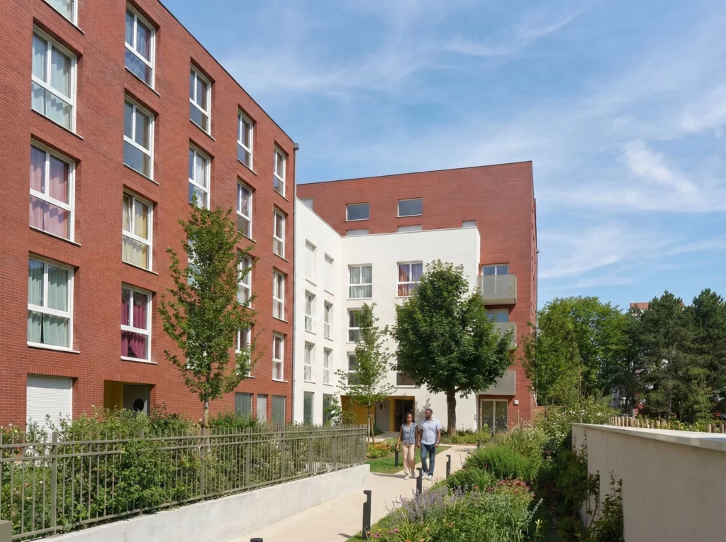
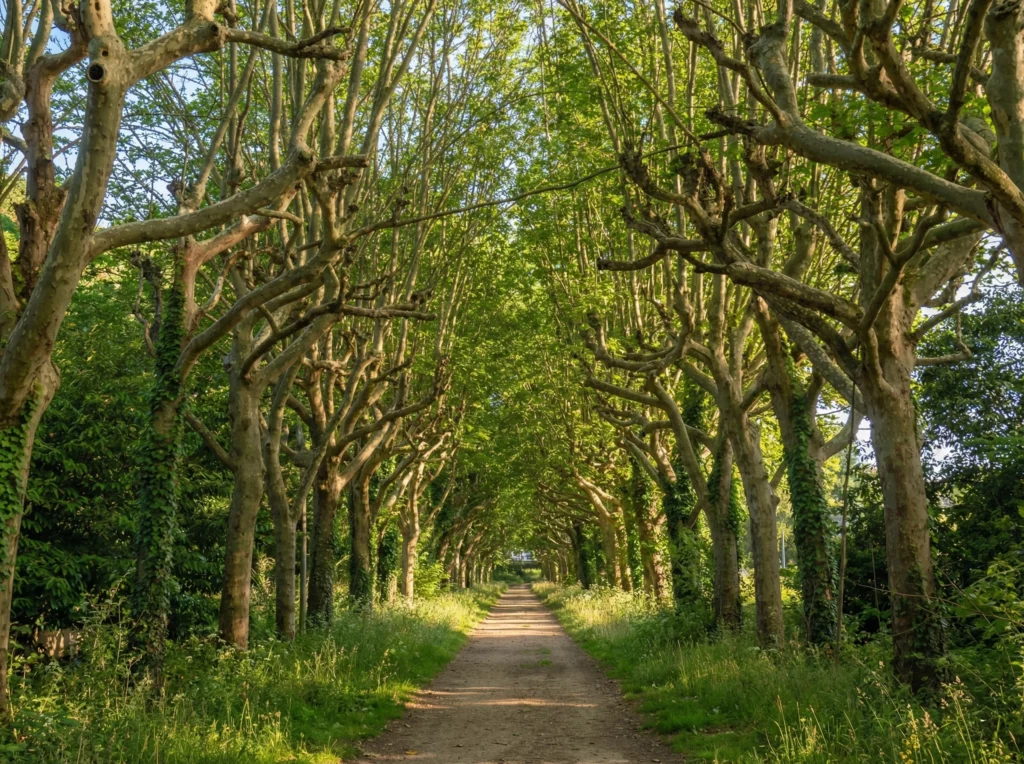
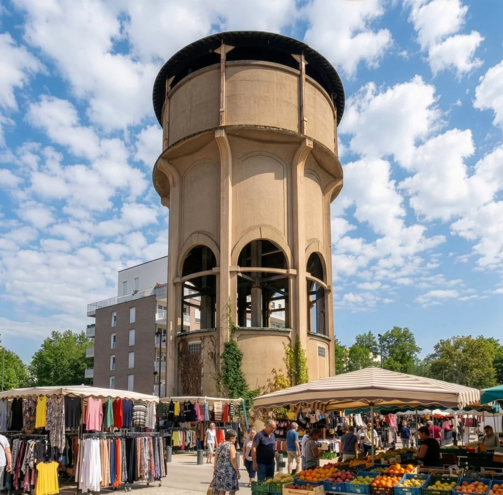
Parc de Maison Blanche, in Neuilly-sur-Marne, is the former estate of a psychiatric hospital with Anglo-Norman architectural heritage, now undergoing a complete urban transformation. Blending historical heritage and contemporary development, the site spans 58 hectares and combines new housing, public spaces, and biodiversity preservation.
The Association of Residents of Parc de Maison Blanche supports this evolution by fostering connections among residents and backing local initiatives.
The challenge was not to create an institutional identity, but to establish a simple, unifying, and lasting visual language capable of supporting the life of the neighborhood long-term. The identity needed to remain legible, accessible, and adaptable, while maintaining sufficient coherence to structure the association's communication in a context of non-expert users.
Project Type
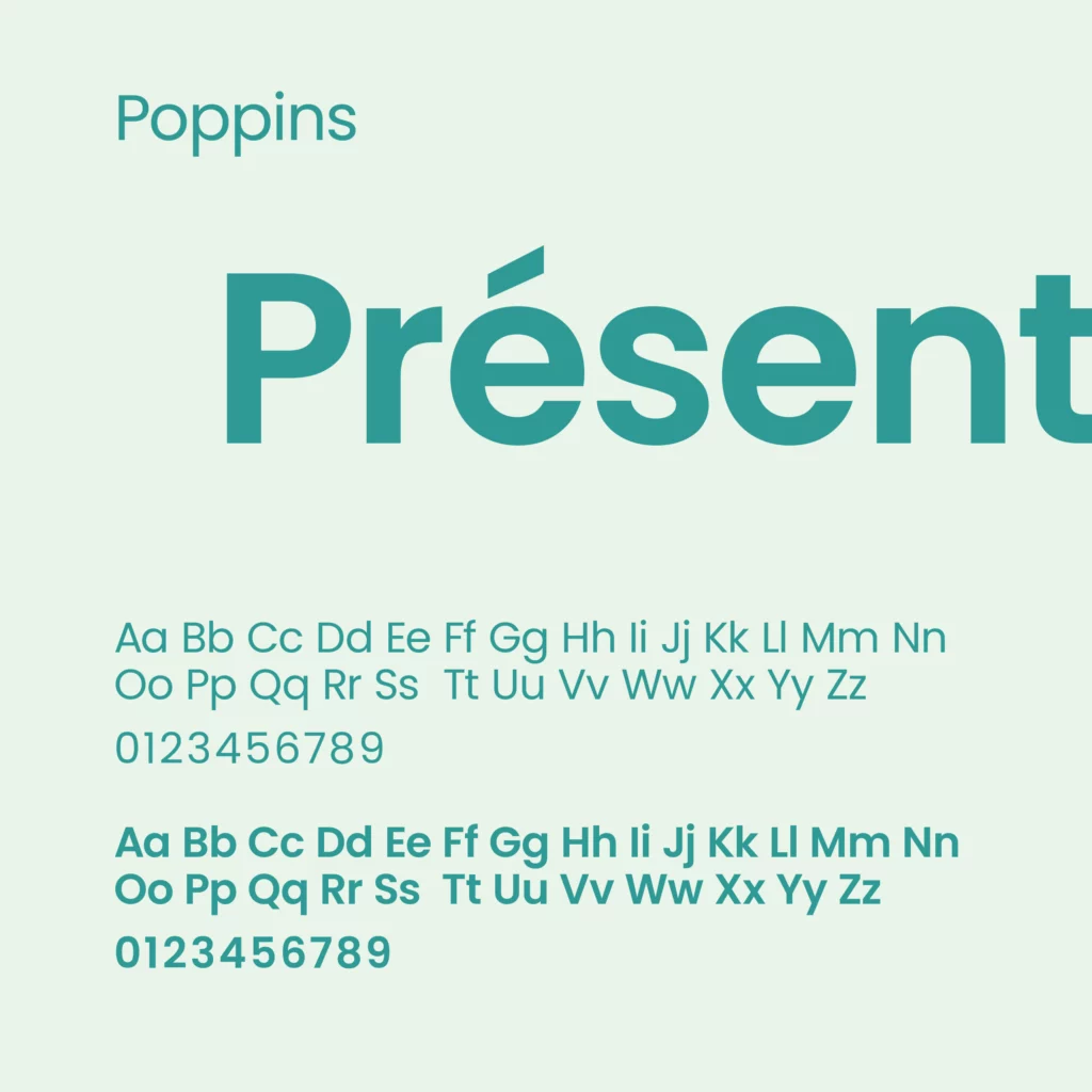
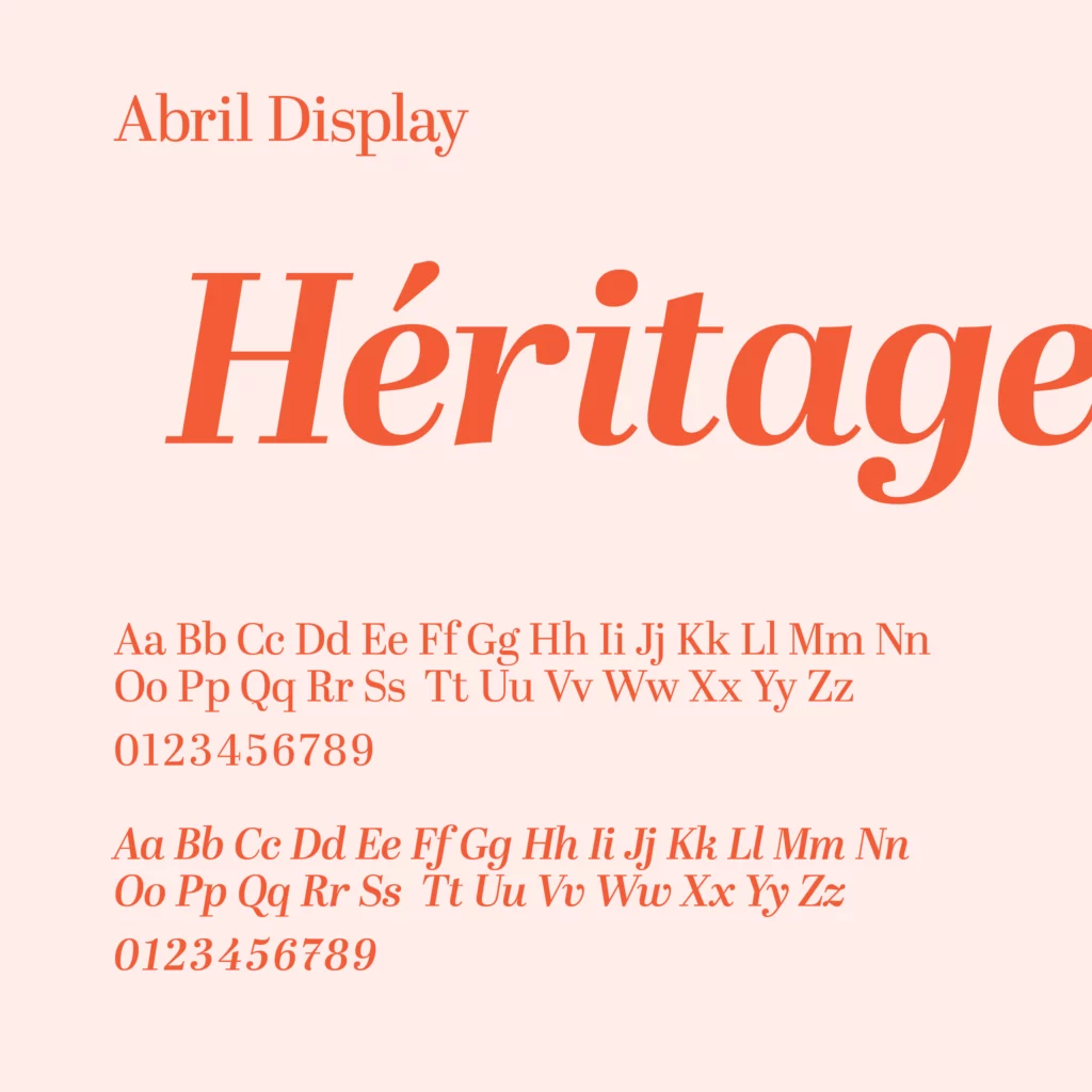
Visual Identity
Brand system
Print Media
Context
Local Association
Volunteer Project
The Intention
The identity was conceived as a tool for connection rather than just a symbol.
A visual language capable of bringing people together without exclusion, structuring without constraint, and accurately reflecting the life of the neighborhood.
The form needed to remain sufficiently neutral to accommodate various uses, while still retaining an identifiable personality.
The identity thus integrates into the association's daily life with simplicity and consistency.
Architecture
Home

Human
Life
Exchange
Sharing
Nature
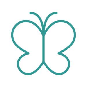
Metamorphosis
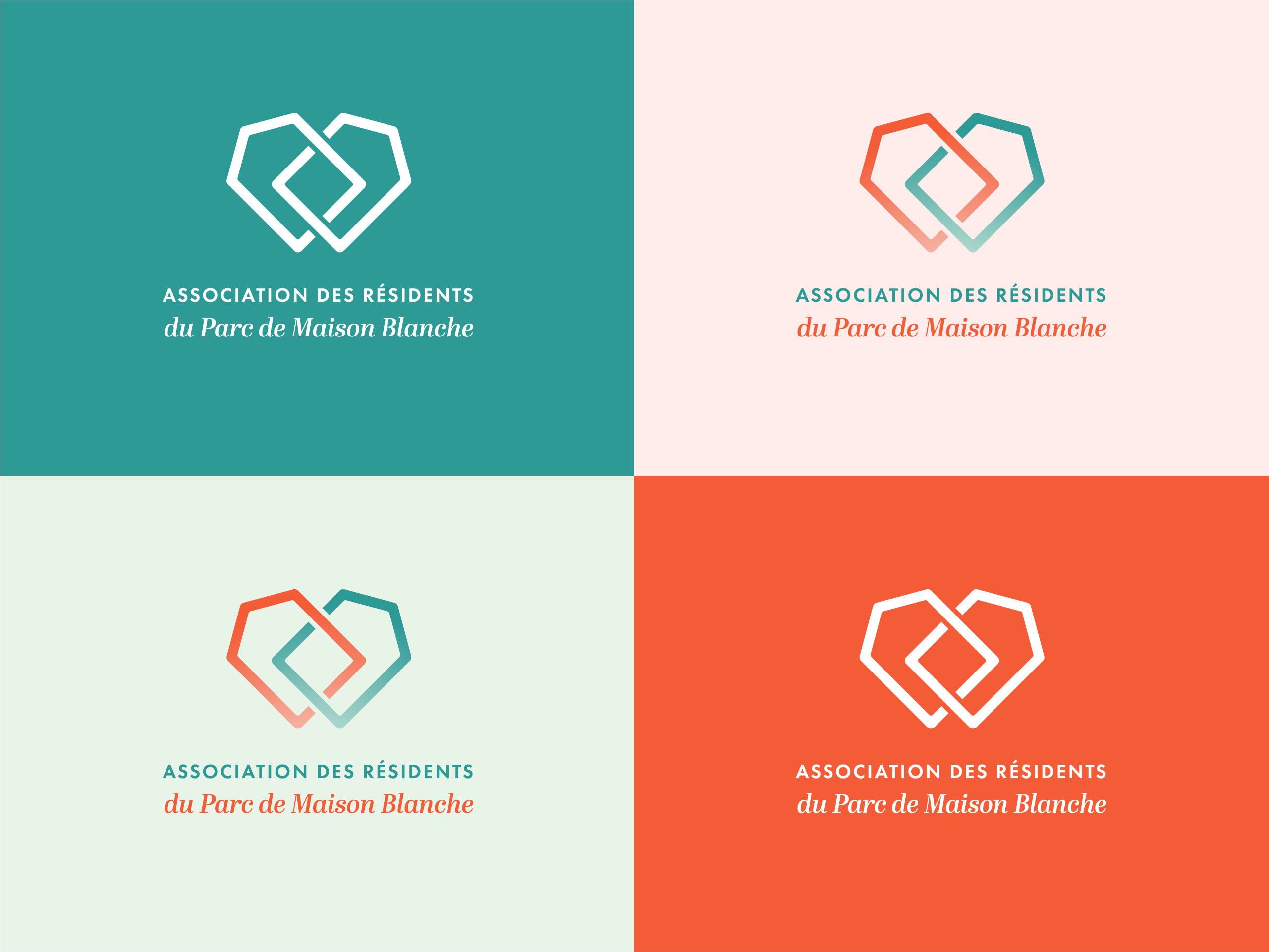
The Logo Concept
At first glance, the heart asserts a clear human dimension: residents, commitment, and attachment to the neighborhood. The park is not just an urban project, but a lived territory.
This heart is constructed from two intertwined architectural silhouettes that form its framework. They evoke the coexistence of contemporary buildings and historic Anglo-Norman structures. Two eras, two homes, one shared place.
Their convergence outlines a frame around a central square: Place Louise Labé, the true heart of the neighborhood. The intertwining suggests exchange and connection between residents and with their environment. The symbol does not freeze; it connects.
The butterfly interpretation introduces an organic dimension. It refers to the park's biodiversity as much as to the site's gradual transformation. A metamorphosis inscribed in time.
The logo merges these layers into a unique and coherent form, reflecting the neighborhood: a balance where heritage, humanity, nature, and evolution coexist.
Teal
Brick
Fringe
Clearing
Morning
Evening
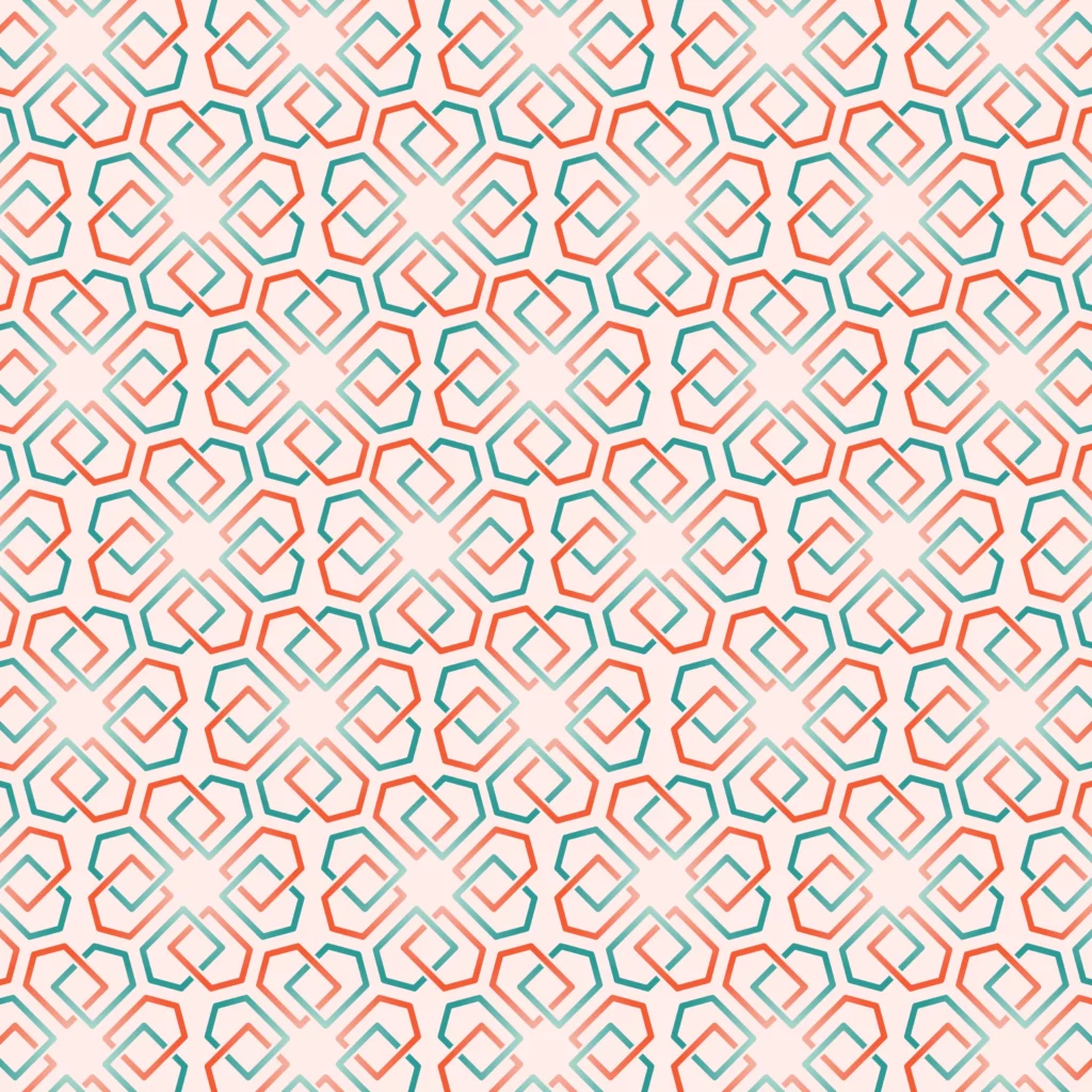
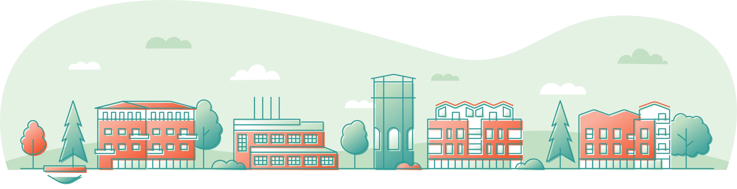
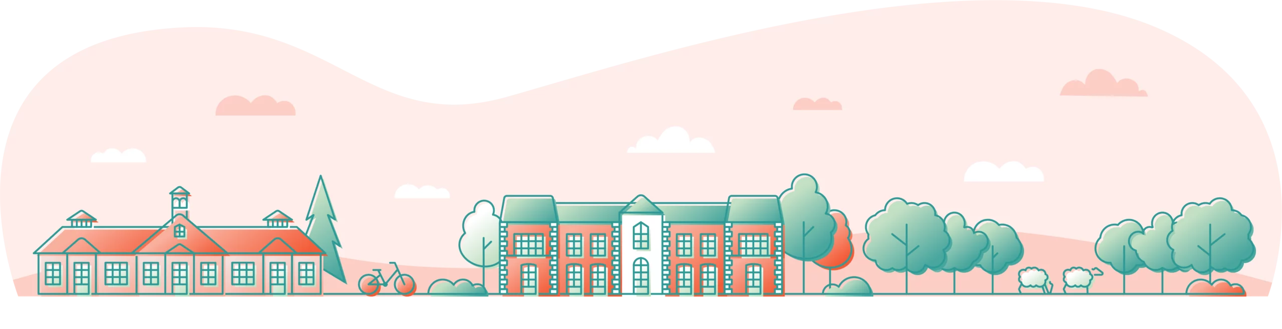
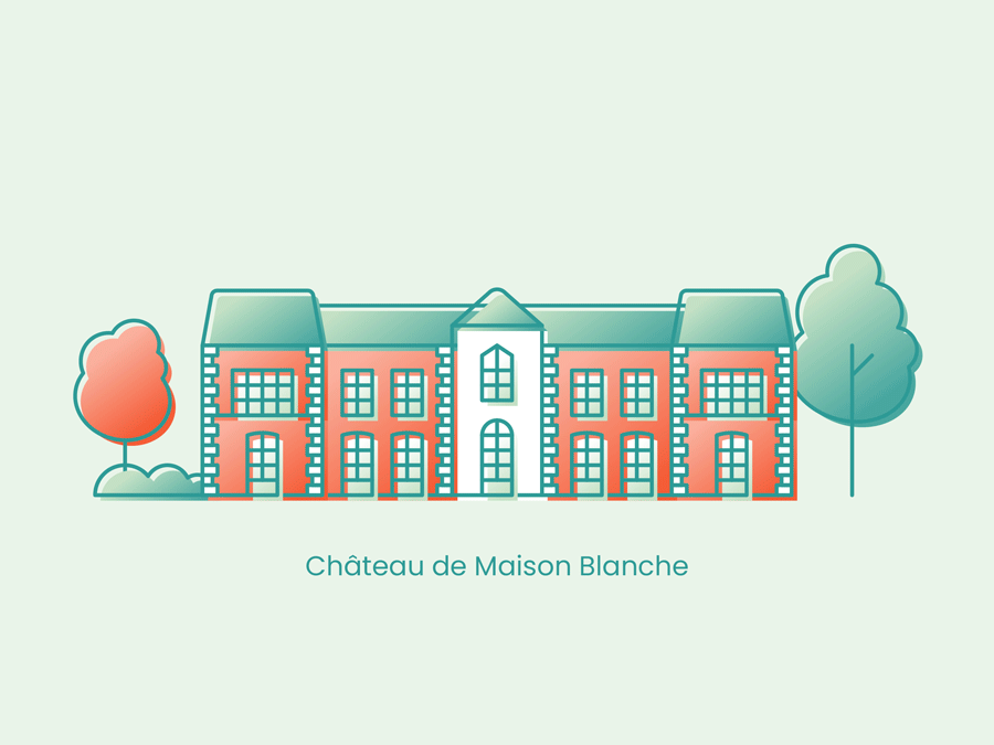
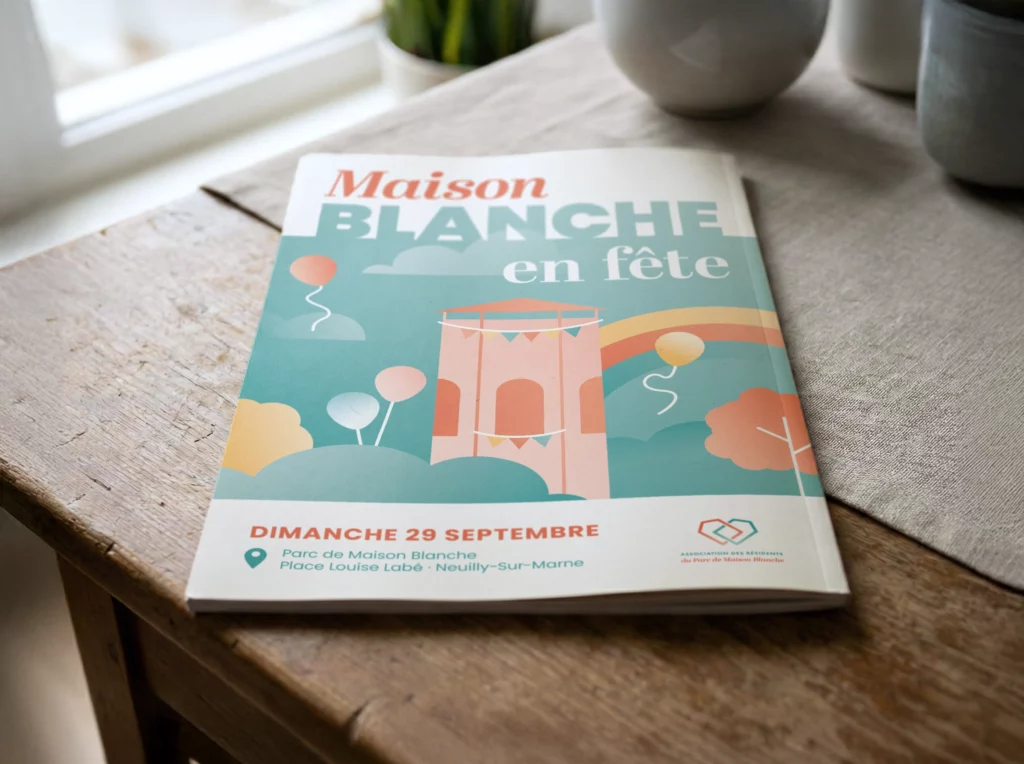
Illustrations as a Language
To enrich the identity, a set of illustrations was developed as a complementary graphic language.
These illustrations visually anchor the association within its environment, evoking the architectural heritage, contemporary renewal, and the park's natural dimension.
They bring additional warmth and humanity to the main system, without competing with the logo.
Used judiciously, they reinforce the identity's recognition while allowing great freedom of adaptation depending on communication contexts.
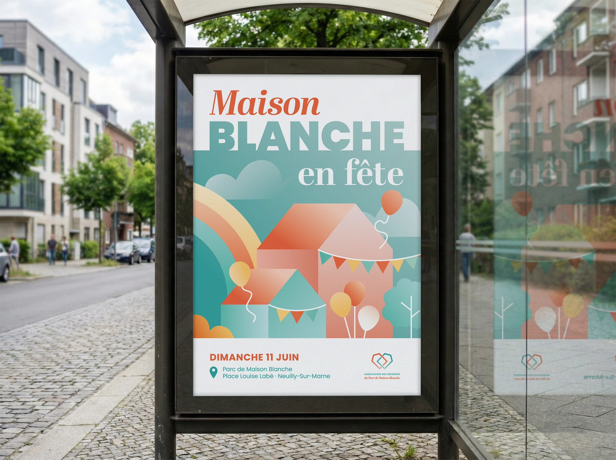
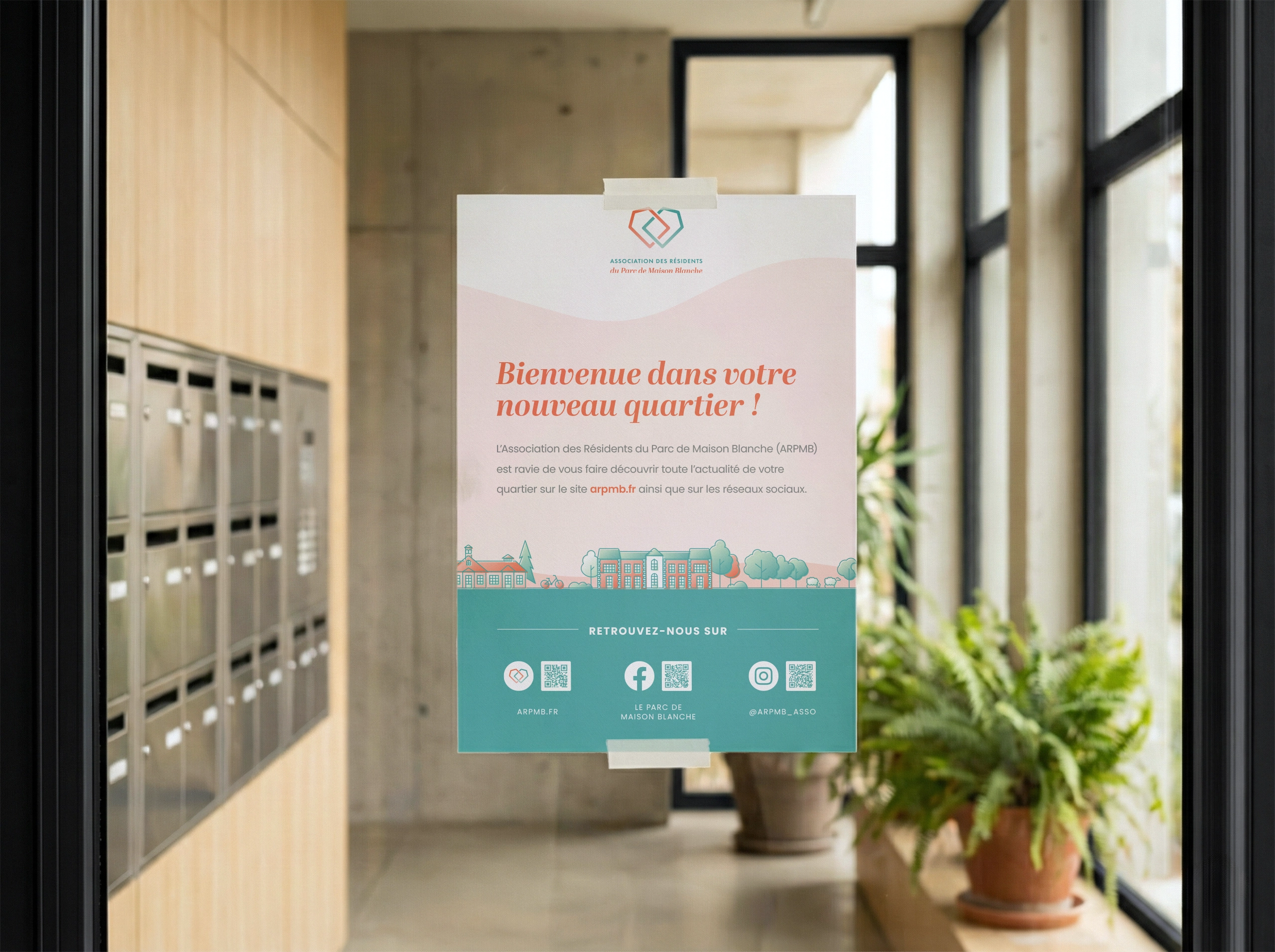
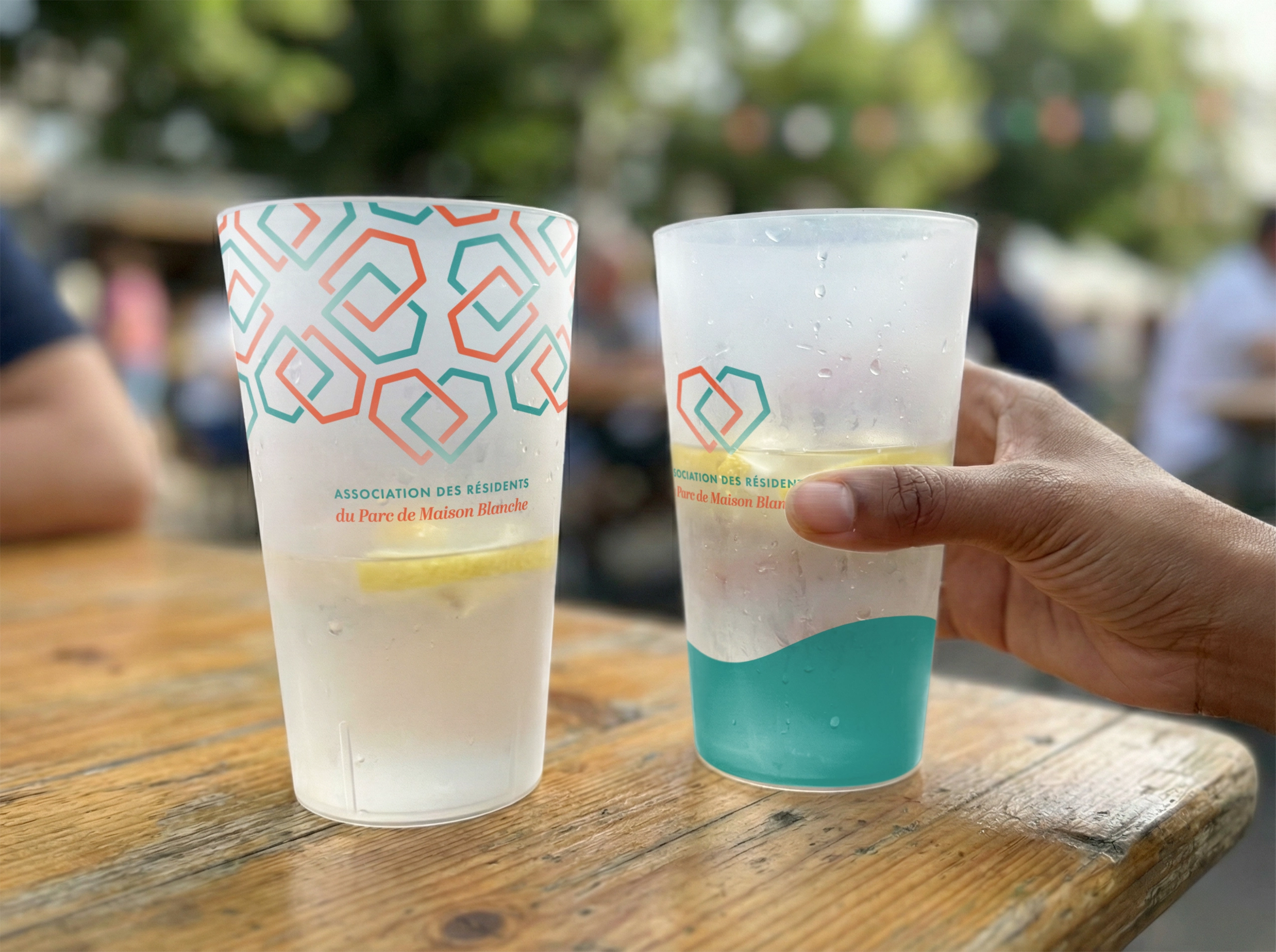
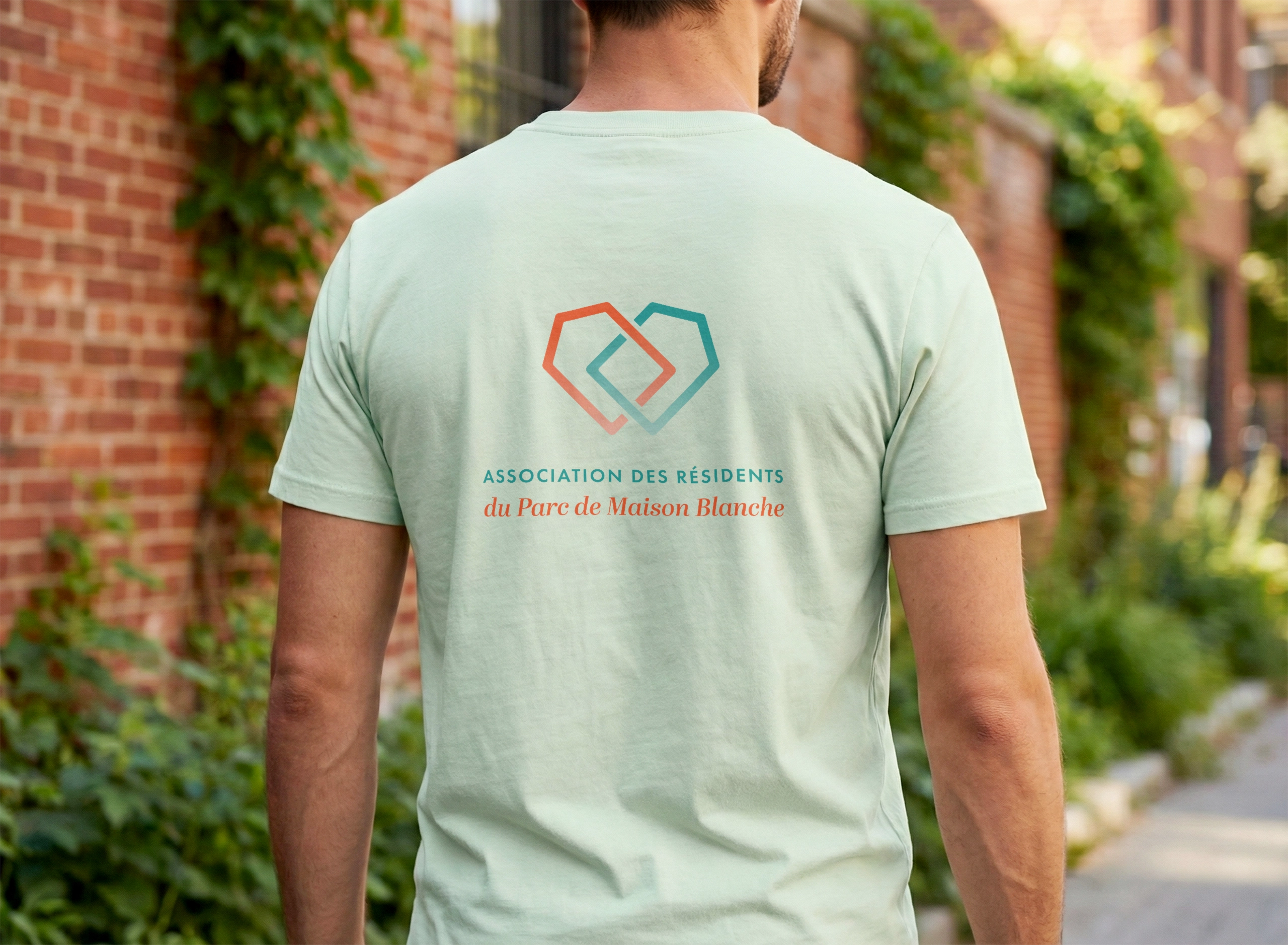
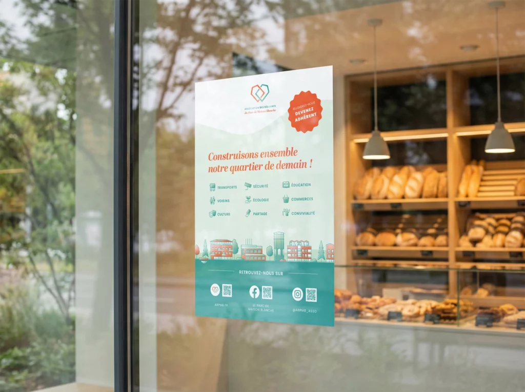
A system designed for use
The identity was conceived as a simple, modular, and reproducible system, intended for practical local communication applications.
Each graphic element was developed to work across various media: informational posters, event materials, membership flyers, and long-term products, all independently.
Priority was given to clear hierarchies and ease of adoption.
The goal was not to multiply rules, but to ensure lasting consistency, capable of withstanding time and daily constraints.
This project was carried out on a voluntary basis.
The presentation focuses exclusively on the initial design phase and the deliverables produced within this context.
The elements presented reflect the intention, the system, and the materials as they were designed and handed over to the association.
Some visuals are illustrative and may come from image banks or be AI-generated.